This part of the post gets somewhat technical.
The new connorrothschild.com is live! (You’re likely reading this post on connorrothschild.com, so that isn’t a surprise).
My new site, which is my fourth personal website, is built with Sveltekit and takes inspiration from creative coders like Félix Péault and Henry Desroches. You should check out their sites if you haven’t already—they’re pretty great.
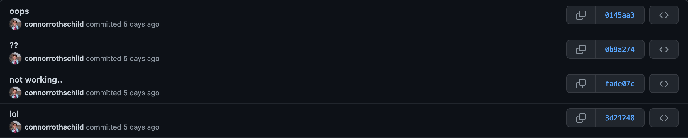
I spent far too long on this iteration of my personal site (see the commits).
In this brief post, I’ll detail some of the highlights, headaches, and give some practical tips for creating a personal website.
Creativity & content
connorrothschild.com is meant to be a highly creative, but still content-focused personal site. Here are some examples of sites that served as inspiration on both fronts.
Creativity
You can find plenty of examples of creative websites by perusing the collection of awwwards Site of the Day winners. This collection is mostly comprised of ‘creative coders’ who build highly creative, design-focused sites, usually for brands of for their own portfolio. A great example of an incredibly creative personal website is Niccolo Miranda’s:
What makes the site great—beyond its general aesthetic—is its unified theme of a ‘paper portfolio.’ The site is meant to resemble a newspaper, and is chock-full of animations and design decisions that support that association. You can read more about those decisions in his thread below:
Content
On the other hand, many sites are designed with content in mind. These sites tend to reduce ‘fluff’ and focus on making sure users are able to easily find and peruse content, such as blog posts. This tends to be the default for most developers who maintain a personal portfolio or blog, but don’t describe themselves as a ‘creative coder.’
Perhaps the most extreme example of a content-focused personal website is Paul Graham’s:
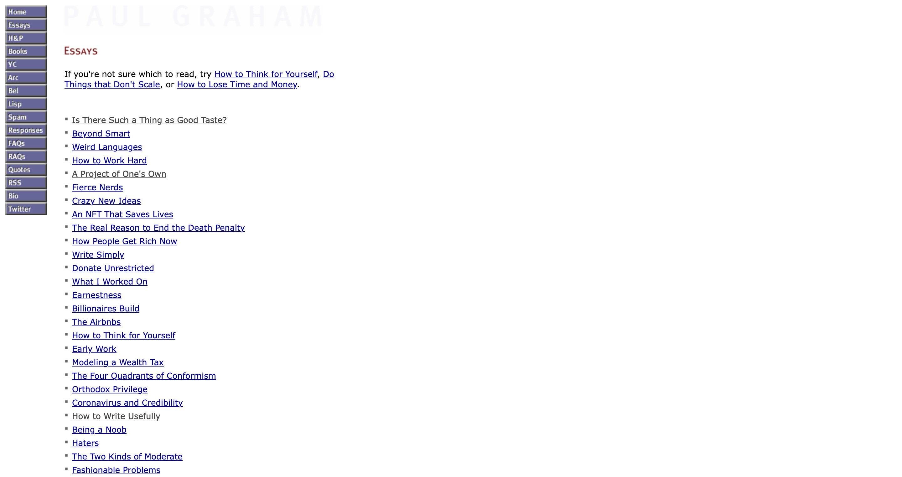
The site is not meant to be pretty, but it gets you the content you need immediately.
Beyond its easy navigability, the benefit of a site like this is your visitors know what to expect. When you click on a blog post, you get a blog post, with nothing distracting you from the main content. No page transitions, no whimsy, just content. Visitors know that they are visiting your website to learn about your thoughts, not to be impressed by your ability to put a website together.
Why not both?
In designing connorrothschild.com, I aimed to make a site that had just enough whimsy to be interesting without it being distracting.
Practically, that meant introducing creativity whenever possible while ensuring that visitors had a consistent experience across content-specific pages. For example, each of my project, blog, and award pages have a consistent ‘blog-post’ style layout:
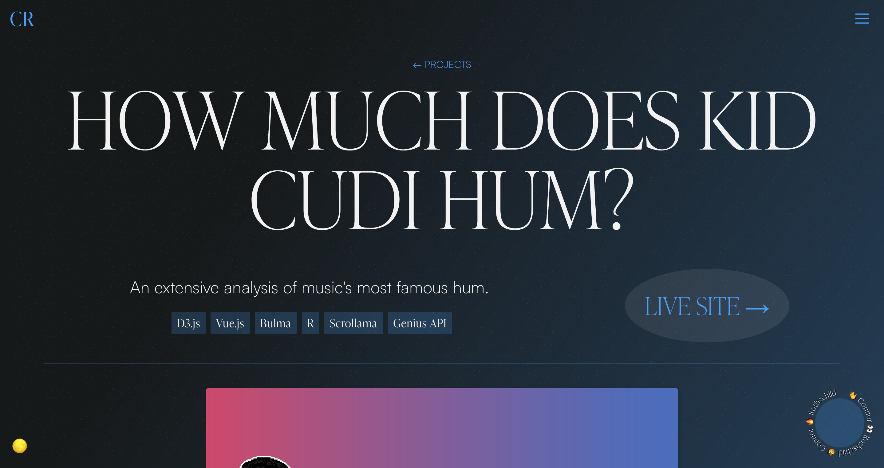
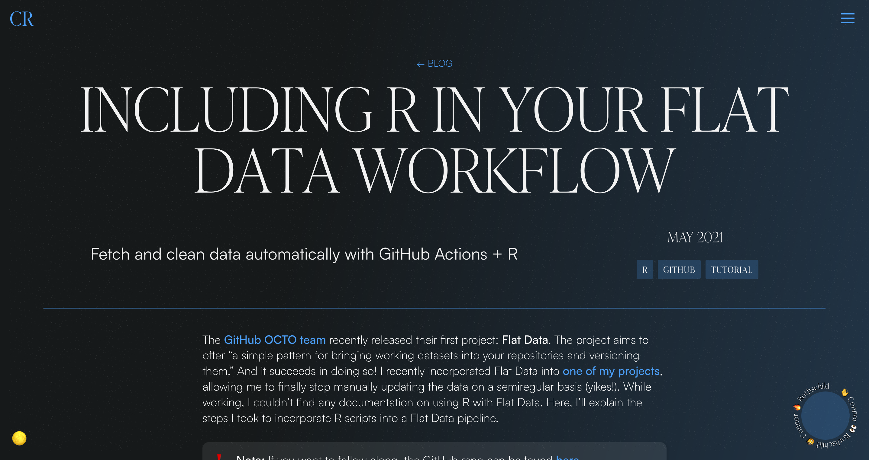

When a user visits any of these content-based pages, they see a title, subtitle, and the main content with a max-width: 768px applied. There is consistency within categories (awards, blog, projects), and across them.
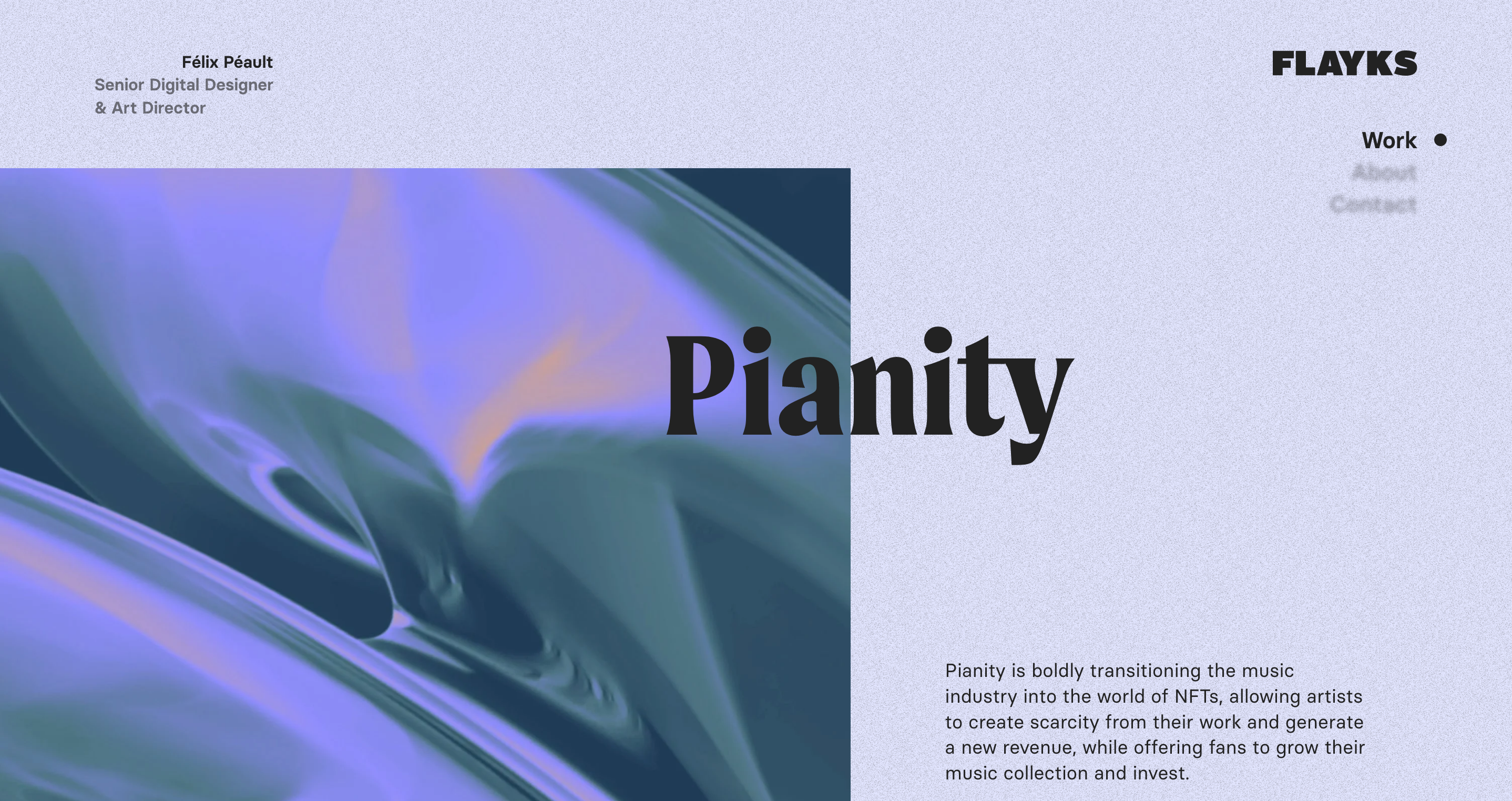
Alternatively, I could have designed each of these sections with their own quirks, (e.g. full width images and grid based layouts introducing constituent parts of the content), as you see in sites like Félix Péault’s:
I chose not to do that, for two reasons.
First, to build a consistent user experience across different types of content, so that users spent less time getting ‘onboarded’ to my site, and more time spent engaging with the content. For certain developers (e.g., self-described creative coders), the creativity within project pages is something to showcase—for others, its nota s important.
Second, because I’m not as good at design as Félix. 😆
Skills aside, there is value in impressing your users on a homepage, and rewarding them with simpler content once they request it (e.g., by clicking a blog post). If you ever feel limited on time and are worried about not being able to include whimsy and creativity throughout your site, this could be a good approach.
Parts of the site I hope you enjoy
Here are some parts of the website I hope you enjoy and maybe pull inspiration from.
GSAP SplitText transitions
The site’s main text elements (e.g. section titles) are animated using a combination of IntersectionObserver and GSAP’s SplitText plugin. This enables cool transitions like this one when an element scrolls into view:
Hi, I'm Connor Rothschild!
See source codeThe projects section
The projects section on my site’s homepage is one of its more creative elements. As you can see in the video below, it layers transparent videos with overlaying text elements, to give the appearance of the videos ‘popping out’ in an almost-3D fashion.
Here’s how it’s done. (Continue reading to nerd out, or skip to the next section) The first step was to create mockup videos for each project, which I was able to do via Rotato.
Once the videos were created, I had to convert them to transparent videos, which was made harder by the fact that different browsers encode transparency with different formats. (Chrome uses webm, Safari uses mov with HEVC.) I downloaded videos from Rotato and used the application Shutter Encoder to output videos compatible with all browsers.
Finally, after creating 8 transparent videos (4 .mov and 4 .webm), I was ready to include them in the projects section. The question then was how to render the videos. The obvious option was having 4 different <video> tags, each with two <source> elements, and toggle the transparency of each on hover. I found that this led to some lagginess on video load() and play(), so I needed to find a different solution.
Instead, I ended up preloading each of the four videos as Blob() objects and then dynamically updated the video source to match the active video. The Blob() method enabled caching of the videos on all browsers and devices (to my understanding, iOS refuses to cache large videos if they were passed in as a regular source).
Technically, this meant I had to detect whether the user’s browser supported HEVC alpha, and then pass in the video source dynamically to the Blob construction. This function detects if the user’s browser supported HEVC alpha (adapted from this snippet):
jsimport Bowser from "bowser";

function supportsHEVCAlpha() {
  if (!browser) return false;
  const navigator = window.navigator;

  const thisBrowser = Bowser.getParser(window.navigator.userAgent).getBrowser();
  const os = Bowser.getParser(window.navigator.userAgent).getOS();

  const hasMediaCapabilities = !!(navigator.mediaCapabilities && navigator.mediaCapabilities.decodingInfo)

  const isSafari = thisBrowser.name === "Safari";
  const isMac = os.name === "macOS";
  const isIOS = os.name === "iOS";
  const version = {major: os.version.split('.')[0], minor: os.version.split('.')[1]};
  const isPast1015 = version.major > 10 || (version.major >= 10 && version.minor >= 15);

  if (isMac && isSafari && isPast1015) return true;
  if (isSafari && hasMediaCapabilities) return true;
  if (isIOS) return true;

  return false;
}
I then used that function to determine whether to update the video source to be our .webm or .mov file.
Whew! Here’s the code for preloading videos, and here’s how we update src dynamically.
Noise
Having a background noise applied to the body of your personal website is kinda in right now. It’s also very easy to carry out technically. (Zoom into my site’s background to see the effect.)
Here’s a simple <Noise /> component (which is really just entirely CSS) that we put in our __layout.svelte so that it is present on every page of the site. We (optionally) apply a shake animation so that it jitters a bit as well.
You can create your own noise texture on a site like this one, and use the <Noise /> component above to add a bit of flare to your site.
Preference-respecting animations
I had a blast integrating a mixture of subtle and not-so-subtle animations into my site. For example, when you first visit the site, you’re greeted with my name flying into view (code):
When you scroll throughout the site, content more subtly fades into view (code):
Both of these animations (and all others on the site) respect the user’s prefers-reduced-motion setting. Practically, this looks like applying animation functions and transitions only when the user has no motion preference. In CSS, that looks like this:
css@media (prefers-reduced-motion: no-preference) {
  .transitioning-container {
    transition: opacity 1000ms ease 200ms, transform 1000ms ease;
    opacity: 0;
    transform: translateX(-5%);
  }
  .intersecting {
    opacity: 1;
    transform: none;
  }
}
And in Svelte/JavaScript, that means building an app-wide store that corresponds to the user’s motion preference, and then applying whatever transition() function you’ve defined only if that store is false.
store.jsimport { readable } from 'svelte/store';
import { browser } from '$app/env';

const reducedMotionQuery = '(prefers-reduced-motion: reduce)';

const getInitialMotionPreference = () => {
  if (!browser) return false;
  return window.matchMedia(reducedMotionQuery).matches;
};

export const prefersReducedMotion = readable(getInitialMotionPreference());
App.svelte<script>
import { prefersReducedMotion } from "./store.js";

onMount(() => {
  if ($prefersReducedMotion) return;
  transition(); /* Defined elsewhere */
});
</script>
What are your thoughts?
Do you like this site? (Hopefully!) Hate it? (Hopefully not!) Reach out and let me know what you think, or if anything is broken for you!
This site was built with SvelteKit; although the framework is powerful, it hasn’t yet reached 1.0, so there are definitely issues that should arise along the way. I made the intentional choice to use a growing framework, rather than an established one, so that I could be an early adopter of this framework I have a lot of confidence in.
Thanks for reading, and thanks for visiting this site! I hope you enjoyed it.