Svelte is good for data visualization in general. If you want a primer of using Svelte with D3 to create visualizations more generally, check out this post.
Scrollytelling has become a fundamental component of data visualization in most modern newsrooms. It’s also one of the most apparently technically challenging techniques to master. I’ve been interested in scrollytelling for a while; I’ve created one of the few scrollytelling articles in R, and since then I’ve been relying on Javascript frameworks like Vue and Svelte to make scrollytelling easier.
In my experience, the developer experience of creating a scrollytelling visualization has the least friction when working in Svelte. This is thanks to reusable components, built-in tweening of numbers, and easy integration with D3.
What follows is a guided introduction to your first Svelte scrollytelling story. It leverages 1) Russell Goldenberg’s reusable <Scrolly /> component to track the user’s scroll position, 2) Svelte’s built-in tweened values to cleanly transition datapoints, and 3) D3 scales to convert these raw values to points on a plot. By the end of this tutorial, you’ll be able to create something that looks roughly like this:
Before we create the chart, let’s take a brief look at the elements at play. (If you’re already familiar with these concepts, feel free to skip to the creation of our chart).
Step 0a: Understand Russell’s <Scrolly />
Russell Goldenberg’s Scrolly component is a reusable .svelte file which developers can easily plug into their code.
A @sveltejs scrollytelling component in < 100 lines. @SvelteSociety https://t.co/l8fOJaiwkX pic.twitter.com/VJclnWSmhT
— Russell Goldenberg (@codenberg) August 31, 2021
It’s not super important you understand how the component is built, but rather how you can use it. In action, you can include the Scrolly component in your code like so:
svelte
This renders three bits of text, and applies a class of active to the current step.
Thanks to line 6, currentStep will be bound to the current step index. (Russell’s Scrolly component is handling this—you don’t have to worry about it.) In other words, as you scroll down and the first step comes into focus, currentStep will be set to 0.
Then, on line 8, we set an active class to the step content if currentStep is equal to the step index. Practically, this means that we can make sure that the step in focus is visually distinct from others (e.g. by changing its background or text color).
To showcase exactly how this works, let’s add some minor styling to our .step and .step-content elements:
css
Don’t worry too much about what’s happening here. In simple terms, .step will be the container for each step, and .step-content will be the text content of each step. We want these two to be distinct so that .step can take up the full window height (e.g. there won’t be multiple steps in view at the same time), and so that .step-content can fit nicely into a text box. (This structure is quite standard for most scrollytelling pieces.)
Then, in our final rule, we make our .step-content element (the text box) stand out if it is active.
This results in a simple (text-only) scrollytelling experience, where the text that is in focus also stands out visually. Notice how the steps are inactive at the top and bottom of the screen?
Notice that we (on line 6) create a steps array that contains paragraphs that we include in each step; this makes integrating prose a bit easier.
Congrats! You’ve completed the first step of your Svelte scrollytelling project. If all we wanted to do was toggle the visual appearance of text elements, we would be done. (But we don’t. We instead want to include data, as we explain below.)
Step 0b: Understand tweened values
Now that our app tracks the user’s scroll position and which step is in focus, we want to modify the data in focus based on the active step. This is common in scrollytelling articles; the user scrolls and the chart elements (e.g. points) animate to new positions.
In our case, we’ll achieve this by using Svelte’s tweened values. By creating a tweened value, we tell Svelte that changes to that value should be animated. Rather than immediately jump from our first number (e.g. 100) to the next (e.g. 200), the tweened value will smoothly transition between the two numbers (e.g. 100, 101… 200).
Below, you can see what this looks like in action. This example includes a tweened value that changes according to the current step (watch the bottom left as you scroll).
svelte
Step 1
Step 2
Step 3
0
Notice how the value begins tweening as soon as a new step becomes active. These are triggers, not scrubbers—the transition occurs at the point at which a new step becomes active, and the tween is not linked to the scroll position.
In our scrollytelling piece, we’ll leverage tweened values to transition the x positions of elements in a scatterplot. We’ll add to our example from above by adding some data to our steps, and animate between those datapoints at each step.
In simple terms, the logic will look like this:
- Active step updates based on viewport
- Tweened values update based on active step
- Points animate to their new x position based on tween
Now that we understand tweening, let’s create a minimal scatterplot to animate!
Step 1: Build a chart
Let’s begin by building a simple, static scatterplot. The scatterplot will have 9 points, each with an x and y position.
This scatterplot is intentionally minimal and therefore omits certain best practices, such as responsiveness. (We assign a fixed width and height of 400px.) I’m attempting to minimize the non-scrollytelling code to make this tutorial more streamlined.
The final version of this scatterplot is responsive and follows other best practices, but is a bit more complex.
In order to create our chart, we obviously need data:
For this scatterplot, we will set foo to correspond to each points’ x position, and bar to correspond to their y positions.
Here, we’ll need some way to map “raw values” to “computed values”—that is, we want the number 9 (the highest in our dataset) to be at the upper bound of our chart.
Scale the values!
D3 scales are the conventional way of mapping one set of values (e.g. raw numbers) to another (e.g. computed ones). Although an in-depth look at D3 scales is beyond the scope of this tutorial, our scales will look like this:
svelte
Essentially, for both our x and y values, we are creating a function that will take in something within the domain (e.g. 5, right in the middle), and spit out a value within the range (e.g. 200, because that is the midpoint of the specified range).
Still not making sense? Here’s an interactive example: input a number between 1 and 9 and see the position in our range that it outputs.
Input
0Output
0px
We use scales like this one to map our raw values, ranging from 1 to 9, to a corresponding position on our chart, ranging from 0 to our chart width (in our case, 400px).
Now that we understand D3 scales, let’s include them in our scatterplot to map foo and bar to x and y positions.
We’re going to create an SVG with a width and height of 400px, and then we’ll loop through our data array we created earlier with an {#each} block. For each point, we’ll create a circle element with a cx and cy attribute that are computed via xScale and yScale. Focus on lines 28 through 40:
Nice! This (admittedly imperfect) chart will be a good starting point for our final scrollytelling visualization. Let’s combine what we’ve learned about tweening, scrollytelling, and this chart to finish up.
Step 2: Tween x positions
In the static chart above, we have an array of objects, each with a foo and bar property. By using D3 scales, we map each of these properties to positions on our chart.
In a dynamic, scrollytelling visualization, we’ll want these values to be dynamic and tweenable. In order to achieve this, we’ll make a tweened array, where each value in that array is animatable just like the tweened values we looked at earlier.
Practically, that means we would instantiate a tweened array with our starting x positions, as you see on line 15 below. Then, we can set that array to contain new values with the functions between lines 17 and 22. Go ahead and try below!
svelte
Your values: 4 1 9 2 8 9 5 4 1
The takeaway here is that we can tween arrays the same way that we tween numbers. This should make it more clear how we can animate the positions of our circles!
Once we have a tweened array of x positions, we can reference the values in our markup in an {#each} loop via their index, like this:
svelte
Practically, we’re just passing each value in our array into the xScale and yScale that we created earlier. Not much has changed.
The main difference is that, now, if and when these values change, they will animate smoothly. The D3 scales will convert each tweened value (even the ugly decimals) to a position on the chart.
In the REPL below, you can see this code in action. Notice how, if you click on either of the buttons, the x positions of our circles animate smoothly:
Here, we’re seeing the power of combining 1) Svelte’s tweened values, 2) Svelte’s {#each} loops, and 3) D3 scales.
By combining these three concepts, we’ve built an animated chart in 55 lines of code! (And 10 of those lines are just defining the data, but who’s counting?)
Step 3: Animate point positions via scroll
Our final step is to trigger the animations between point positions (as we do above with buttons) via the user’s scroll. Here, we’re going back to Russell’s <Scrolly /> component.
Recall in an earlier example we triggered an update to our tweened object in a code block like this:
svelte
This bit of code uses Svelte’s dollar label operator $: to run code reactively. In action, this means that the above if... else block will run every time the variable currentStep changes. Then, depending on the value of currentStep, the if... else block will evaluate differently.
For React users, this is similar to useEffect, and Vue users can compare it to watch properties.
All we need to do now is update currentStep via <Scrolly />, and update our tweened data array in our if... else block. In combination, the process will look like this:
- Trigger updates to
currentStepvia<Scrolly /> - Tween our array of data in our
$: if... elseblock - Pass the tweened data into our
{#each}loop which renders SVG circles
Here’s a complete example combining all of the insights we’ve discussed so far:
Next steps
We could extend upon our chart in a few ways. The logic that we used to tween x positions is extensible across any value that can be animated. We could do the same tweening to each circles’ y positions, or their radius. Now that we understand the pattern that enables scroll-driven tweening, we can use it for things like position, size, and color.
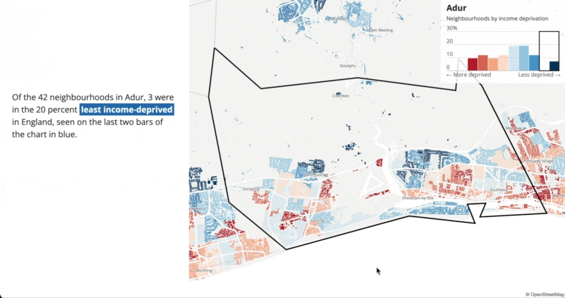
And in visuals other than scatterplots, we could use scroll-driven interaction to tell a more dynamic story, such as linking an interactive map’s viewport to the user’s scroll position, as we see in this article from the UK’s Office of National Statistics:
A final, polished example
The scrollytelling visual we created was a starter kit, and as a result it neglected certain best practices. For completion’s sake, here’s a REPL with a complete, polished scrollytelling visualization.
This example separates the charting logic into its own <Scatterplot /> component, and includes a few lines of CSS to make it more responsive. When the canvas is larger than 767 pixels, it will place the text to the left of the chart, rather than directly on top of it. It also tweens the x and y positions simultaneously.
Thanks for reading! As always, feel free to ping me with questions, comments, or tips.